Persuasive Website Design: Part 1 of 8
One of the questions I’m often asked is, “What makes a great website?” Several guiding design principles can work together to create a powerful website that attracts visitors and encourages the desired action. In this blog series, I’ll discuss eight principles—in easy-to-digest segments—that will improve your website, taking it from good to great!
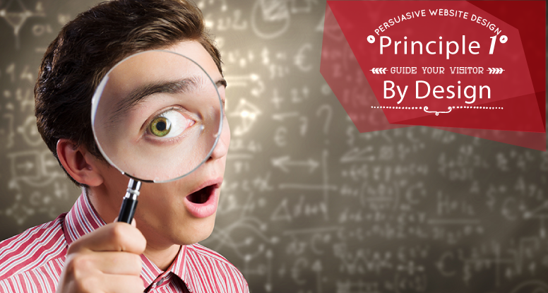
Principle #1 – Guide Your Visitor By Design
Visitors come to your website for a variety of reasons, but hopefully, it’s because they need or want your services. Once you’ve got them on your site (no small feat in itself), keep their interest by telling your story in a clear and persuasive way. This involves more than just the text and images on the page; it actually begins with the VISUAL HIERARCHY of your site.
Using the principles of visual hierarchy, you will strategically guide your website visitors’ eyes to the main message(s) you want to convey. Here are five strategies to ensure your message is received.
- Position – Where items are placed on the page influences the order in which users see them. There have been many studies to discover how people read/view websites for the best retention. Turns out, the top left position is the first place people look, so you should place your most important messages there. Also, fewer people tend to scroll down, so, like a newspaper, your most important messages should be “above the fold.”
- Color – Strategic use of color will draw the visitors’ eye. Incorporate bold and subtle colors in places where you want to focus readers’ attention.
- Contrast – Contrast is a visual difference between two or more items. It can be created by colors, sizes, fonts, and other elements. Effectively using contrast can help items stand out on your webpage and draw the visitors’ visual interest.
- Size – You’ve heard the phrase “go BIG or go home,” right? Well, when it comes to websites, there’s truth in that statement. Big objects (text, images, etc.) take precedence over small items because the eye is naturally drawn to the largest thing on the page.
- Design Elements – If there’s a flashing red arrow pointing to something on your website, where do you think your visitors will be looking? You got it…they will be looking at whatever is at the end of that arrow. Many graphic elements can successfully be designed into your site.
I challenge you to take an objective look at your website and see where your eyes are drawn naturally on the page. Does your site incorporate some or all of these visual hierarchy concepts? What small changes could you make to produce significant results?
Join me next week when I discuss the next influencer of good website design — Spacing and Proximity. Until then, I welcome your comments or questions below.
If you’d like to know more or discuss your specific situation, I’m happy to offer a FREE 30-minute consultation. Simply send me an email.
Nice overview! I look forward to reading the rest of the series. I think its important for businesses to take an “objective” look and there are a ton of testing resources out there (some FREE) that can help them to step outside of the box. Get user testing feedback and look at real data insights to see where people are naturally drawn to on your website and what content resonates with them. Do this frequently and regularly. It doesn’t take much time to learn from your users and make adjustments based on their actual insight!
Thanks April. Excellent suggestion.