
Persuasive Website Design: Part 2 of 8
Now that you’ve learned the artistic aspect of VISUAL HIERARCHY when it comes to your website, it’s time to focus on the next design principle of great web design—SPACING AND PROXIMITY
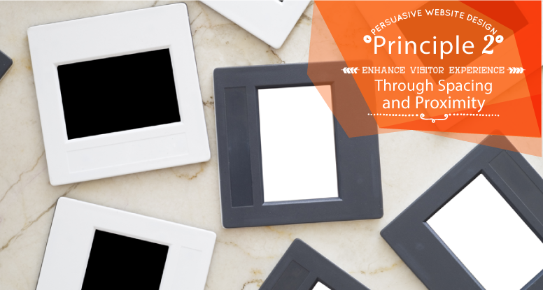
Principle #2 – Enhance Visitor Experience Through Spacing and Proximity
Sting is an internationally renowned musician. One of his greatest hits with his former band, The Police, was entitled “Don’t Stand So Close to Me.” Just like people have a threshold of personal space that buffers them, your website’s text, images, and other design elements should have buffers around them as well. In design, these buffers consist of the principles of SPACING AND PROXIMITY and should be used to strategically organize your website’s messages to clearly communicate to your customers.
Negative Space is a Positive Thing
White Space – The term “white space”—or alternately, “negative space”—refers to the empty space on a web page. Striking the right balance of white space and other design elements can be extremely effective in content management. By organizing content flow using white space in margins, gutters, and grids and around text and graphics, you will help your customers read and digest important information. And don’t let the name fool you…whitespace can be a color as well. So, figure out how you can best use white space to improve your website readability and functionality.
“Leading” Between the Lines
Line Spacing – The space between the lines — called “leading” and pronounced ledding—directly affects the legibility of your content. Too little space makes it easy for visitors’ eyes to spill over from one line of text to the next, making it difficult to read. Conversely, too much space can cause visitors’ eyes to get lost or make the brain think the content is unrelated to the previous line (see proximity below) — either extreme results in confusion. You can adjust the leading to discover what works best for your site, but a general guideline is that your leading point size should be at least as large as your font point size.
Relationships Are Important
Proximity – Do you find it easier to remember things when they are in a group? Most people do, which is why proximity is important. Proximity refers to the organization of related items (text or images) in a grouping, separated from items that are not alike or similar. Placing items close together can visually suggest a relationship between them, which helps readers’ brains organize and process the information. Strengthen your website content by using logical groupings of information to help enhance your readers’ understanding and retention.
Successful use of spacing and proximity can have a very powerful effect on your visitors’ experiences. Visit your favorite website and identify examples of white space, line spacing, and proximity. Now, take a look at your own site. Where have you effectively used the concepts of spacing and proximity? Where could you improve?
Join me next time when I discuss the third influence of good website design — Site Navigation. Until then, I welcome your comments or questions below.
If you’d like to know more or discuss your specific situation, I’m happy to offer a FREE 30-minute consultation. Simply send me an email.